Place Japanese and Western copies of the earlier Pokémon Game Boy titles side-by-side, and the aesthetic difference between them is striking.
Beyond their use of the contrasting Japanese and English writing systems, they carry different art and design approaches, distinct names – even their packaging is of a dissimilar shape. And those variations aren’t just an excuse for collectors to cram more versions of the Pokémon games into their display cabinets; they equally present an opportunity to ponder how games can reflect distinct cultural histories.
By now, any monster snatching devotees reading might be chomping at the bit to point out that in the beginning, the regional variances in Pokémon releases went beyond the packaging. In Japan, the first games of the series went on sale in 1996, and were titled Pocket Monsters Midori and Pocket Monsters Aka, which translated to ‘green’ and ‘red’ versions. When the same series made it to various Western countries between 1998 and 1999, it started with Pokémon Red and Pokémon Blue – which both took considerable influence from Japan’s Pokémon Blue – itself a minor revision of Midori and Aka.
Put simply, different regions got subtly different games. Put honestly, it can all get rather confusing. But comparing their packaging design remains fascinating and valid.
The Japanese originals’ covers have a more explicitly hand-drawn style than their Western equivalents, demonstrate a busier arrangement of text and images, and yet at the same time commit to a bolder style using confidently placed block colours.
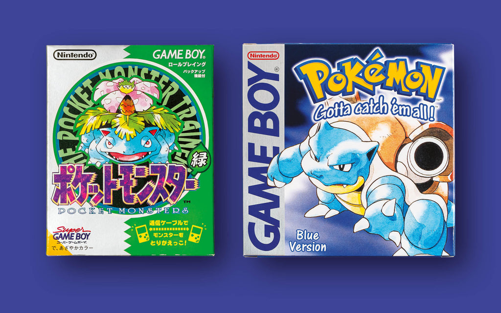
Over in the West, the covers of Pokémon Blue and its kin feel a little more unambiguously like an exercise in marketing – something every game box is, wherever it hails from. But here there is more space for logos, less competing for attention, and a sense that the work of a human hand has been buffed away in the pursuit of promising polish within.
Considered as an exercise in marketing their own contents, the Western Pokémon boxes have been tremendously successful. They introduced the name ‘Pokémon’ itself, a logo with striking punch, and the still famed tagline ‘Gotta catch ‘em all’, which so precisely speaks to the founding spirit of the product within, and has become a touchpoint of popular culture across the globe.
Certainly, you can’t say anything absolute about how Western Game Boy box art is universally different from Japanese equivalents. There are simply too many Game Boy games for that, and there exist a bounty of exceptions to any rules of thumb. But there does appear to be a greater a prevalence in covers from Japan where the human hand behind the illustrations shines through, sometimes right down to pencil sketch marks that have not been tidied away by a computer. The same covers are often more playful and energetic than their Western counterparts. They are equally often busier and packed with more detail, and there is also a little more space for the abstract or absurd.

Sometimes the best examples come from games that are less popular or celebrated. That is perhaps because a vaguely objective analysis is a little easier when you can separate yourself from preconceptions about a given game. So with the developer Human Entertainment’s 1990 sports title Pro Wresting, in Japan we see a playful cartoon of a rotund competitor tumbling backwards over a ref, looking terrified as he accidentally smashes a beer bottle over his own head. Above him a slight, green-haired figure is thundering down towards him, knees towards their target, as an exasperated tag-team accomplice looks on over the ropes. It is a cover that exudes a sense of excitement, silliness and fun.
Over in the West, where the game is called HAL Wrestling, we get heavily worked, vaguely realistic airbrush-esque art of one muscular man holding another above his head. Unlike its Japanese version, it speaks to sincerity, stern aggression, and athletic prowess.
It is a contrast you’ll see again and again when comparing Western and Japanese Game Boy games. In Japan, the Game Boy edition of strategy classic Rampart might not attempt to convey playfulness, but the excitement is there – thanks to a precise drawing of cannons blasting a dragon point blank, surrounded by a collage of the cast. It hypes up the game energetically. Over in the West the same game sports a lone knight screaming angrily ‘to camera’ afront a blurred-out background. With the Japanese release of Taito Chase H.Q. we get a clean, slightly ‘cute’ illustration of two toyish cars crashing while a pair of detectives look on, one grinning. In the west? It’s another illustration layered with polish, depicting a street racing scene from a driver’s viewpoint, their eyes scowling at the view via the rear-view mirror.
In short, so many Japanese Game Boy covers feature smiles, winks and cheerfulness, whether literally or in spirit. More commonly, Western counterparts snarl, glare or furrow their brows sternly. There are plenty of examples that contradict such a generalisation, but there’s equally enough of a pattern to chart.
Again, boxes are about attracting the eye and selling their contents via a single image. It would appear, then, that there is a little more eagerness in Japan to sell games as playthings, and a degree more devotion in the West to sell experiences by learning into the gritty and realistic.

Here we are getting to the point of game packaging art and marketing approaches reflecting their local cultural history. Japan is a place where comics and animation are arguably far more integrated into daily life than in the west, be it through literature, corporate branding, educational works, street signage or the mascots of myriad organisations. Certainly, the commercialised boom of geek culture has spawned a vast market in the West, but such art is still not quite so ubiquitous – not so permeative of every facet of modern life. And, of course, so many comics and related properties spawn have that ‘grittiness’ slider pushed to the top in the West.
But perhaps the schools of design also reflect the kinds of escapism people yearn for in their respective home nations. Could it be that in the West we like to take fun a little more seriously? That we want to devote our leisure time to disappearing to places that promise harsher realities?
But where might that come from? It is very hard to quantify absolutely, but in Japan, where arcade design has always had a greater influence than in the West, there appears to be a greater prevalence of more challenging, difficult games. That could be because Japan is often seen as a place where devotion and discipline are a little closer to the surface of mainstream popular culture. The conventions of Japanese game design were forged in a place where focused discipline is a celebrated part of more daily activities than in the West. So perhaps when the games are difficult enough, cover art isn’t required to amp up what it represents. Equally, it could be that when games are tough, they need to be presented as playful to maximise sales.
Here we’ve been talking about games released to both markets, of course; titles with identical or very similar gameplay that make it to shelves both territories regardless of difficulty. The boxes are different, over and above the games. But the point stands. Difficult gameplay in Japan – along with a long history of embracing and celebrating comics and related animation – seems to have established a style that uses a playful spirit to shift copies. That’s in stark contrast to Western title’s more stern approach.

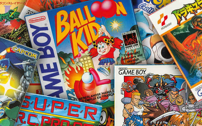
In fact, it’s a trend that is evident in Game Boy: The Box Art Collection, which is packed with high quality captures of a wild variety of game covers for Nintendo’s iconic portable, along with a bounty of expert insight. The book is not devoted to comparing Eastern and Western approaches, but is does present a lavish, vibrant compendium of Game Boy covers from around the world, and to leaf through its pages is a lesson in distinct approaches to game packaging.